Project: 12 + 12, 12 x 12’s #10 by Craig L Haupt
Title-“Back to Back” First sequenced Post.
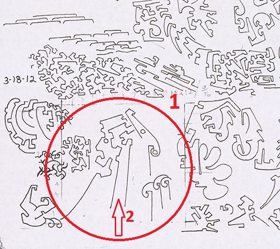
Ah, the start of a New Year and with it the start of the next Painting in the 12 + 12 Art Project. When looking at the two figures sitting back to back in this circled ‘Doodle’ from 2012, I face certain questions. As the creative part begins for the worksheet and subsequent transfer to canvas, I have the artistic freedom to change the ‘Doodle’ to whatever I want to. Yet there is an internal switch that wants to maintain as much of the integrity (a word often used in these First sequenced Posts) of the ’Doodle’ as possible. In this case, my area of contention is the separation of space between the two figures marked by the Red Arrow. If I choose to include it, then the question becomes, what alteration is made to the space to create an object that they are leaning against, a fence?, wall?, hedge?, etc.
Then, of course, there is the question of a narrative.
Next weeks ‘Worksheet’ will show decisions and solutions.
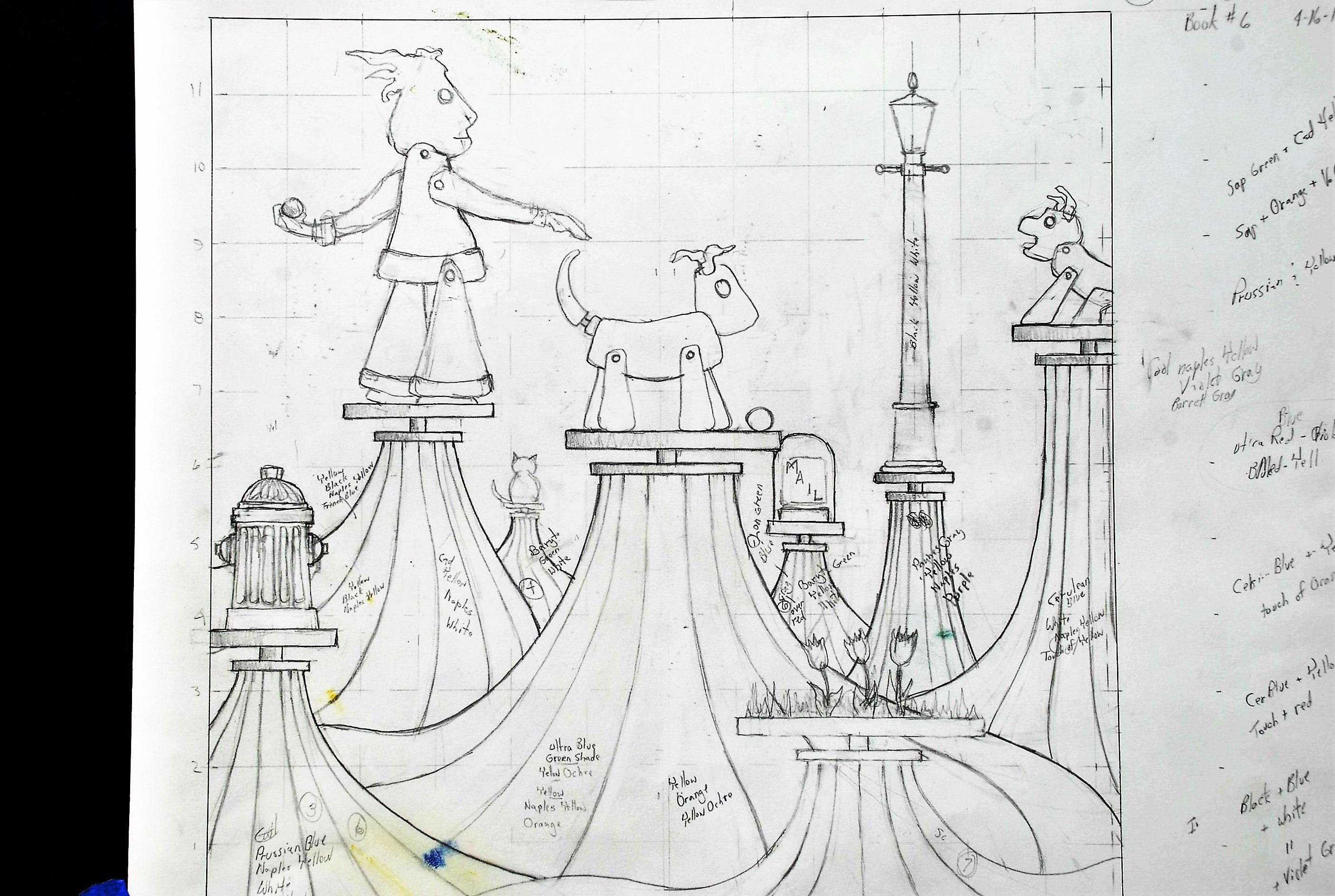
The project will be posted in the following sequence, 1st Monday-the sketch/doodle or related source from whence the painting has originated.
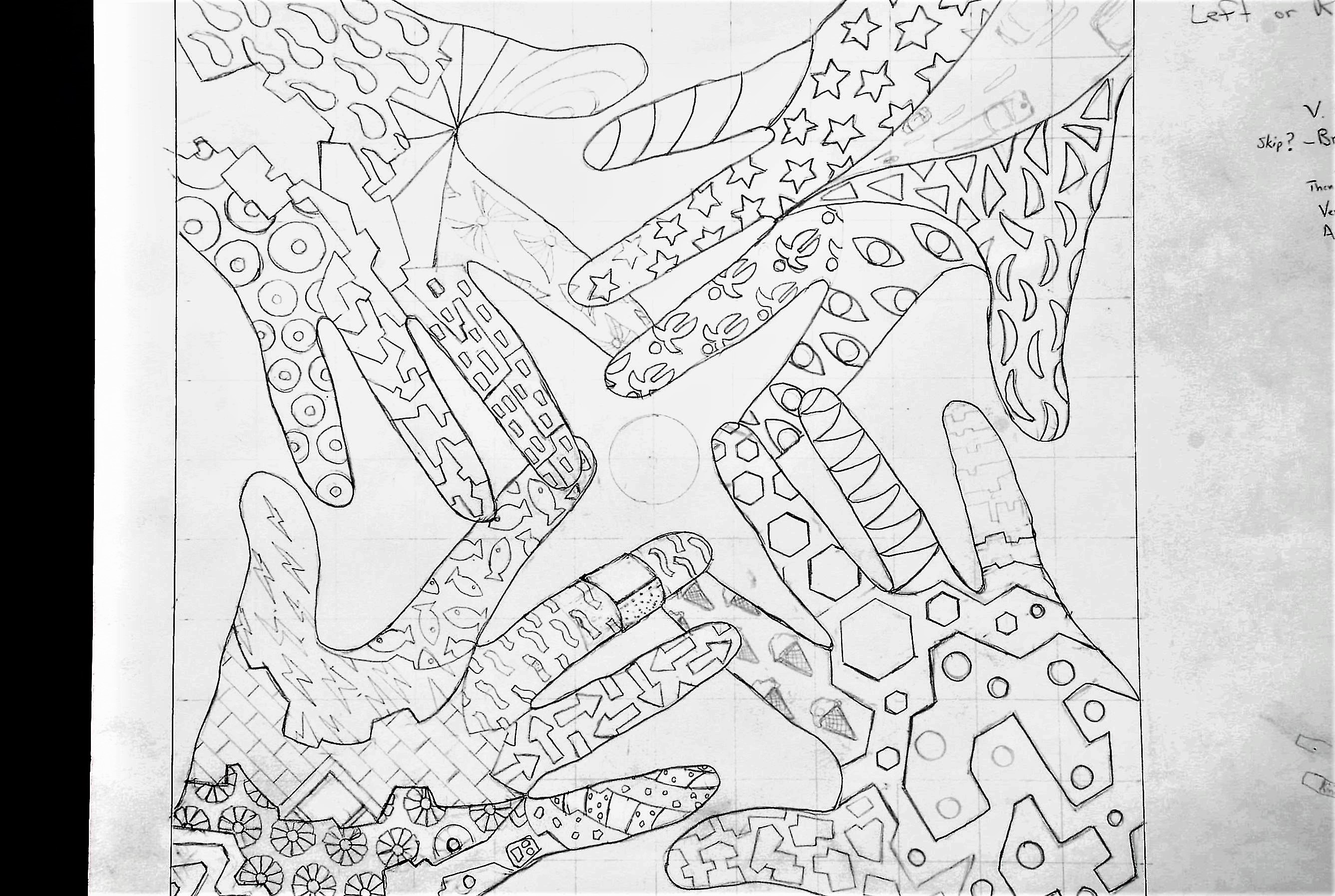
The second Monday-the 12”x12” pencil worksheet showing the intended painting.
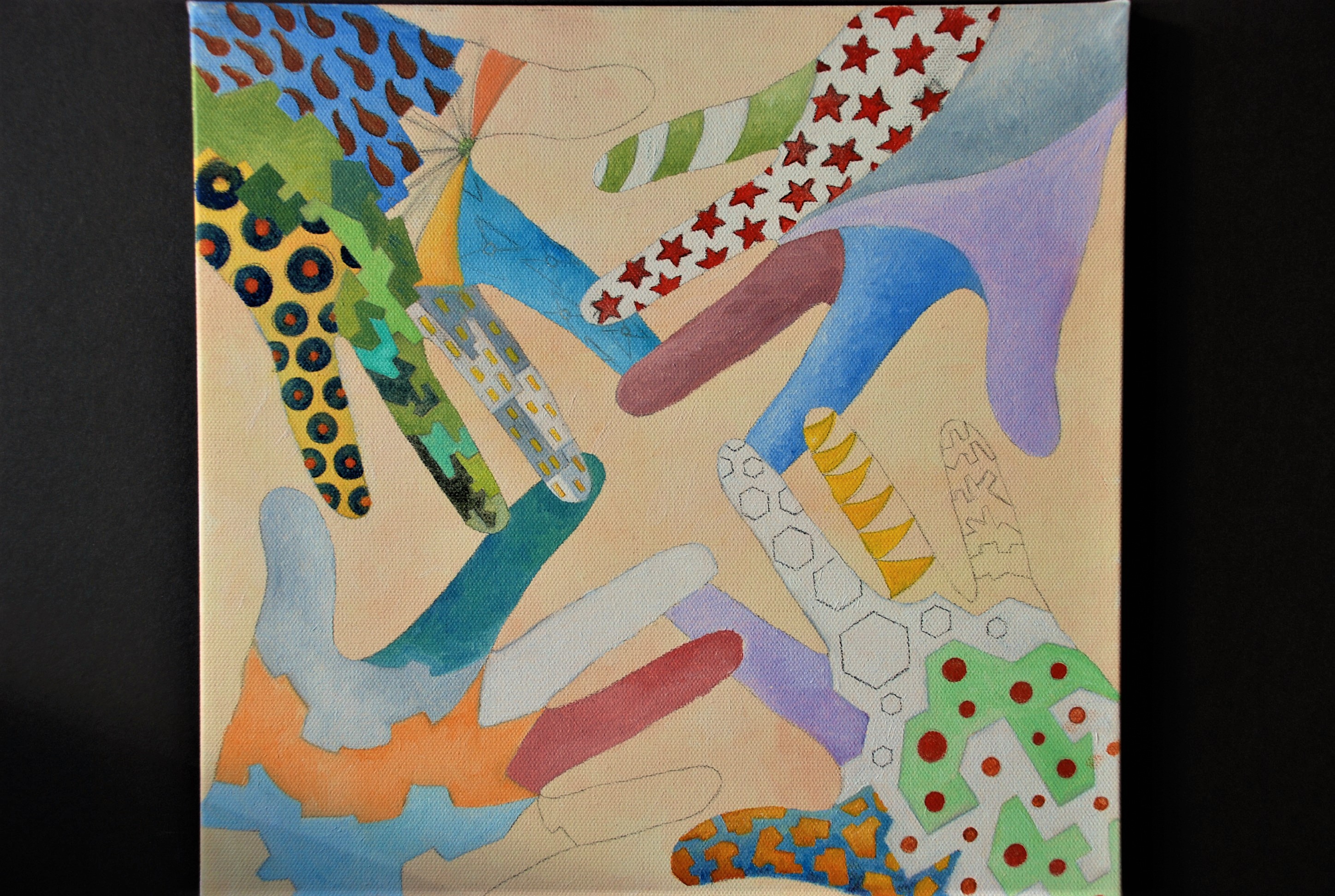
The third Monday-a progress post of the painting.
The fourth Monday-the finished painting.
Then repeat.
Art notes:
All images are copyright Craig L Haupt